
Mobile Suite Showdown - Editor Layout
Productivity apps on the iPad continue to be one of the top selling points for the device. It's no surprise, then, that there are several office suites available in the App Store. This post is going to explore the three main "all in one" suites which are available on the iPad – Documents to Go, Quick Office, and Office2 HD. Apple's iWork is also available in the App store, but the "separate app" nature of the suite sets it outside the scope of this comparison.
Each suite will be explored for file management, editor layout, editing features, and importing/exporting. We'll primarily look at the word-processing features of each suite, but will also compare the spreadsheet and presentations modules for each app. Today we'll be looking at the second comparison – editor layout.

Quick Office
Quick office places it's formatting buttons at the top of the editor screen. The number of buttons is minimalist, with text formatting options to the left and tools to the right. The buttons are persistent, allowing for quick formatting without too much trouble. Oddly, many formatting options are hidden behind a gear icon - grouped with the tools. Found under the gear icon are font options, alignment, lists, colors, and indents. While I applaud the attempt at a minimalist interface, I don't find burying the bulk of formatting options in one cluttered interface to be an elegant solution.
Quick office also displays it's content in a page-layout format - allowing a content creator to see how their content will look when printed or exported to a PDF. This can be a useful feature in some instances, but it ends up wasting most of the iPad's screen real-estate with an exciting display of document margins.
Office2 HD
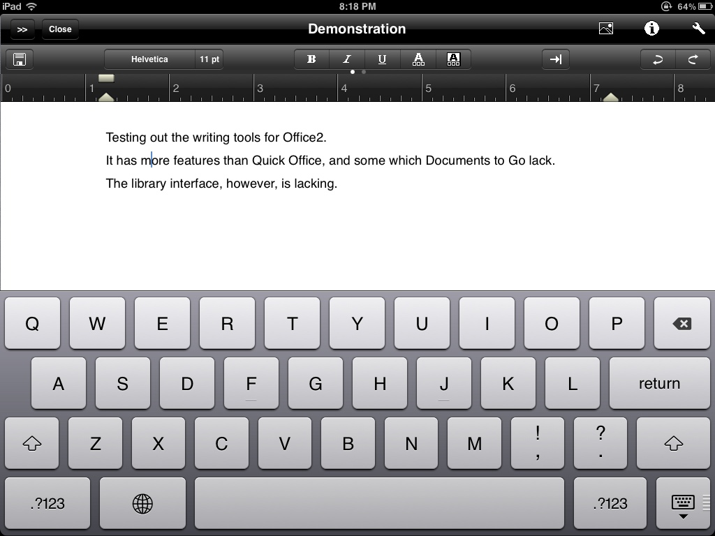
If Quick Office to be minimalist in its layout, Office2 HD celebrates complexity. There are two "pages" of buttons in it's interface - the first holds text formatting options and the second contains paragraph level formatting like alignments, lists, and intents. There is, however, one paragraph level formatting option which can be found in the first page of options - paragraph styles. While is is more a "feature" than a layout choice, Office2 HD is the only "all in one" mobile office suite which supports paragraph styles, and their inclusion as an obvious option is welcome. The buttons are not persistent, though, they only appear when the keyboard is engaged. They also feel cramped, and accidental taps are not uncommon when flicking between button pages.
This suite also defaults to page layout view. Unlike Quick Office, however, there is an option to switch to "screen layout." This makes much better use of the iPad's screen size, and also allows users to zoom the text to a comfortable level without affecting the layout of the page.

Documents to Go
Documents to Go places it buttons at the bottom of the editor. This is likely a carry-over from the iPhone UI, where bottom buttons are easier to reach while typing, but it translates well on to the larger screen. There are five buttons in this row - file options, text formatting, paragraph formatting, lists, and tools. Each button tap reveals a list of common options for that category, along with a "more" option to access more complex formatting. The buttons, however, are not persistent and actually disappear when the on-screen keyboard is active. Again, this is likely a by-product of the suite being a universal app. Hiding the buttons when typing makes some sense when using a smaller screen, but on the iPad the vanishing act gets frustrating.
Unlike the other two suites, Documents to Go doesn't have a page layout view. It uses a screen layout view only, reflowing the text as a user pinches and zooms the content. Given that screen layout view makes much better use of the iPad's screen, the lack of a page layout option isn't missed much.
Conclusion
Quick Office attempts to create a fast, minimalist, interface while laying out content with a metaphor common to a desktop suite (page view). In the end it ends up failing in both button layout and content layout. Office2 HD has a complex, and cramped, interface. It does, however, have two views for content - allowing a user to view content in a way which makes sense on an iPad's screen. Documents to Go manages to split the difference and uses a simple button layout and has no page view option at all. While Documents to Go has some quirks, mostly due to it's universal nature, it's still the best editor layout among the three suites.